Oct 27, 2025
Strategy
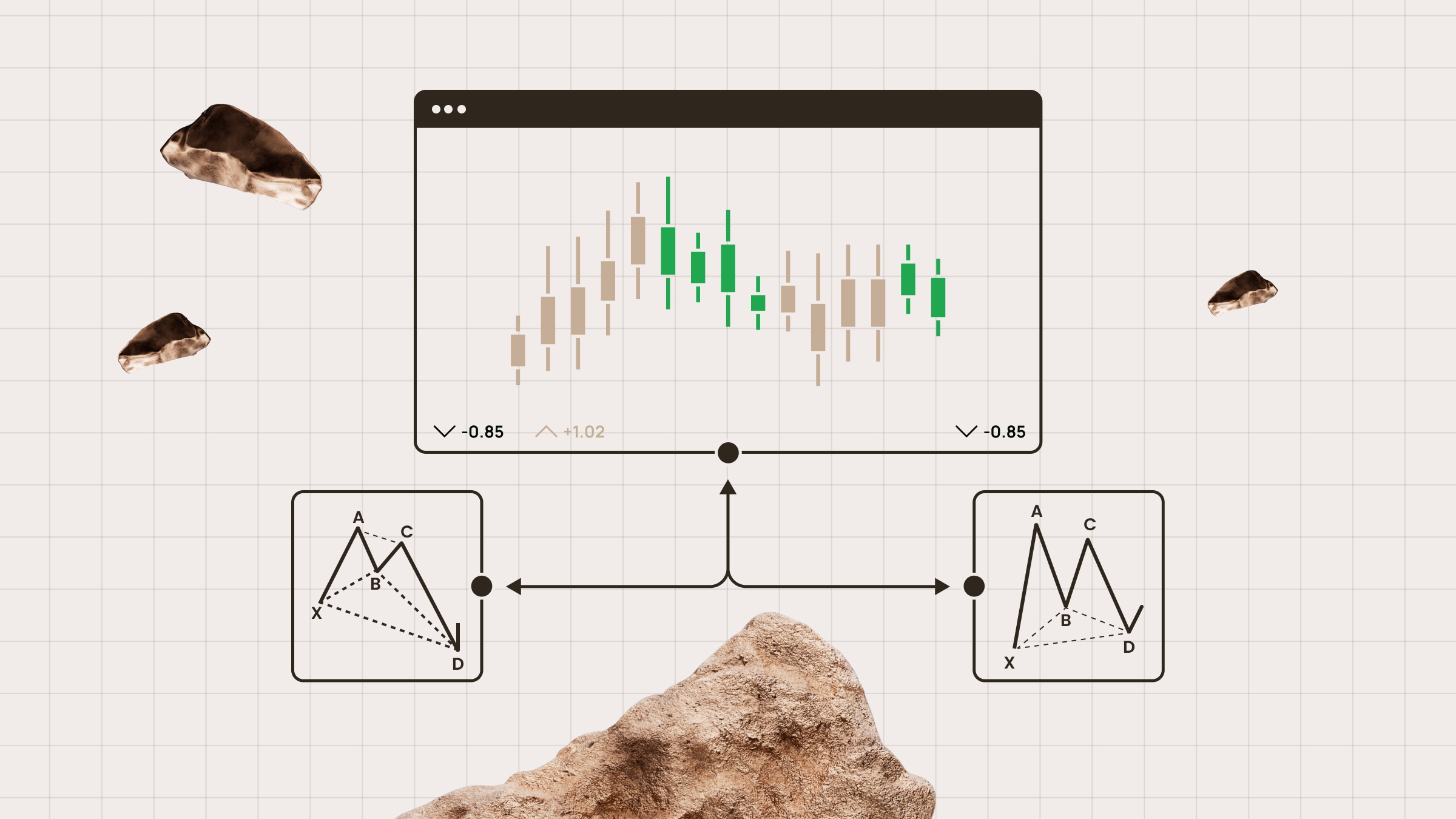
Technical Indicators Every Trader Should Know
As with most things in life, in Forex, knowledge is the key to success. To become successful, a trader needs to learn technical analysis. A big part of that is learning technical indicators.
The MACD, RSI, or Stochastic aren’t as complicated as they sound. In this article, we’ll help you understand how some of the most popular technical indicators work and how they can help you.
Most popular Forex indicators are derived from price data. They factor in volume, tick volume, or other information depending on the market and trading software.
The best technical indicators for forex traders
Choosing indicators according to market conditions
Markets move in different ways. The indicators you rely on should fit the market environment, or you’ll end up potentially chasing false signals.
Trending markets (moving averages, MACD, ADX, and Ichimoku):When the market is trending in one direction, pushing higher or lower with momentum, you want indicators that help you stay with the move without exiting too early. Moving averages smooth out the price and show you its direction. The MACD and ADX give you confirmation that the trend has strength.
Ranging markets (RSI, Stochastic RSI, Bollinger Bands):Sometimes price just bounces between support and resistance, never breaking past them. Oscillators like the RSI and Stochastic RSI tell you when the price is stretched too far up or down, and Bollinger Bands show you the edges of the range.
Volatile markets (ATR, Bollinger Bands):When the market whips back and forth, manage risk. ATR (Average True Range) tells you how much the price moves on average. Bollinger Bands expand and contract with volatility, giving you a sense of when things are heating up.
| Market type | Indicators | What they’re for |
| Trending | MA, MACD, ADX, Ichimoku | Following and confirming the trend |
| Ranging | RSI, Stochastic RSI, Bollinger Bands | Spotting reversals at support or resistance |
| Volatile | ATR, Bollinger Bands | Adjusting stops and profit targets |
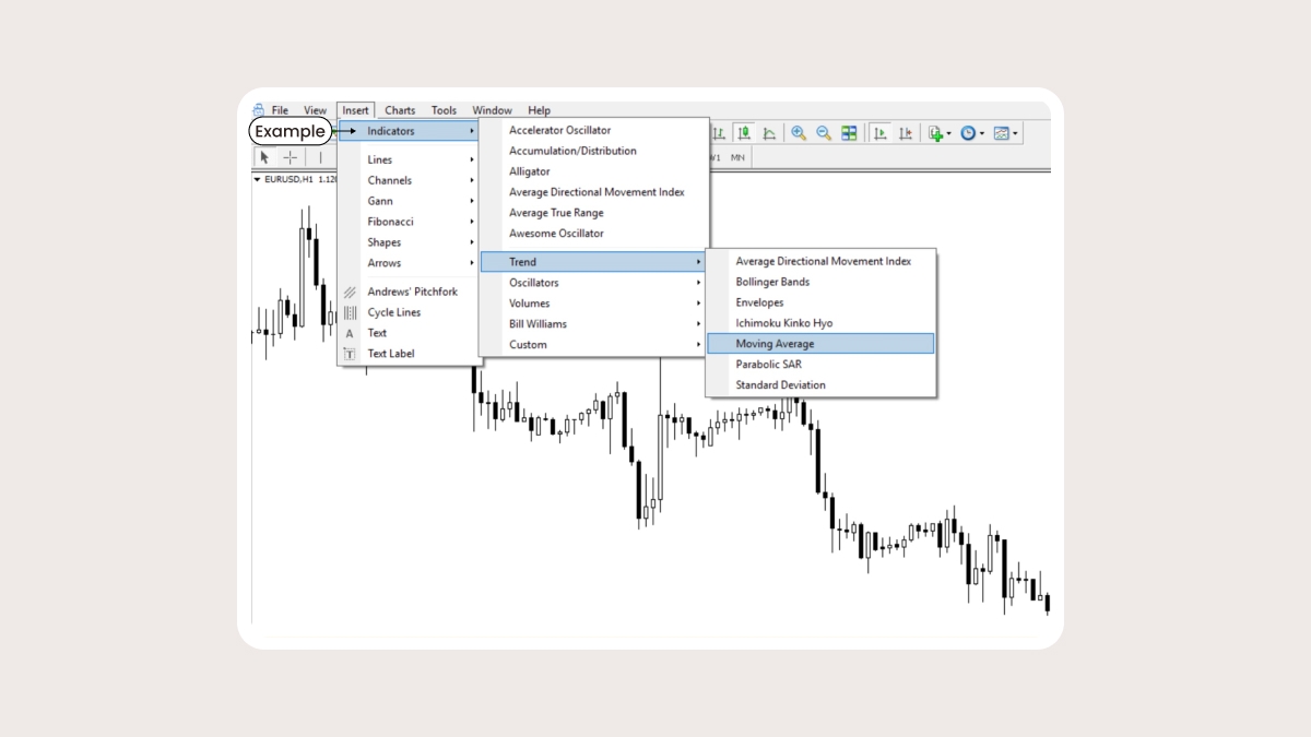
1. Moving average
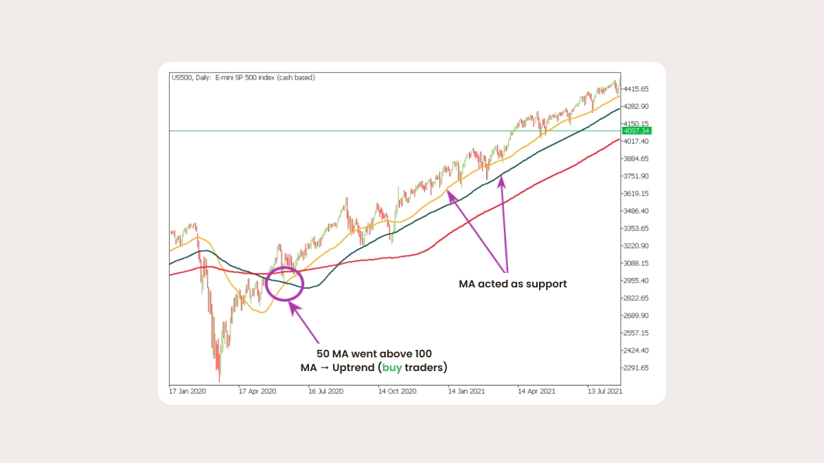
Moving averages (MA) help identify and follow the trend. The MA is a line that shows the average value of a price over a chosen time period. It doesn’t predict future prices, but outlines the current direction of the market. It helps smooth out volatility and get rid of unwanted noise, so you can focus on the main trend rather than corrections. A trend is bullish when the price of a currency pair is above the MA and bearish when the price falls below.
Pros:
Identifies a trend direction.
Finds trend reversals.
Shows potential support and resistance levels.
Cons:
- Lags behind the current price (will change more slowly than the price chart because the indicator is based on past prices).
Tips:
The four types of moving averages are: simple, exponential, linear weighted, and smoothed. EMAs give recent prices more weight, so they react faster. SMAs smooth out noise and give a clearer long-term picture.
Settings & timeframe tips
Default: 20, 50, 100, 200-period SMAs/EMAs.
Shorter MAs (10–20) are useful for intraday trading but produce more false signals.
Longer MAs (100–200) on daily or weekly charts reduce noise.
Common mistake:using too many MAs on the same chart, causing confusion.
2. RSI
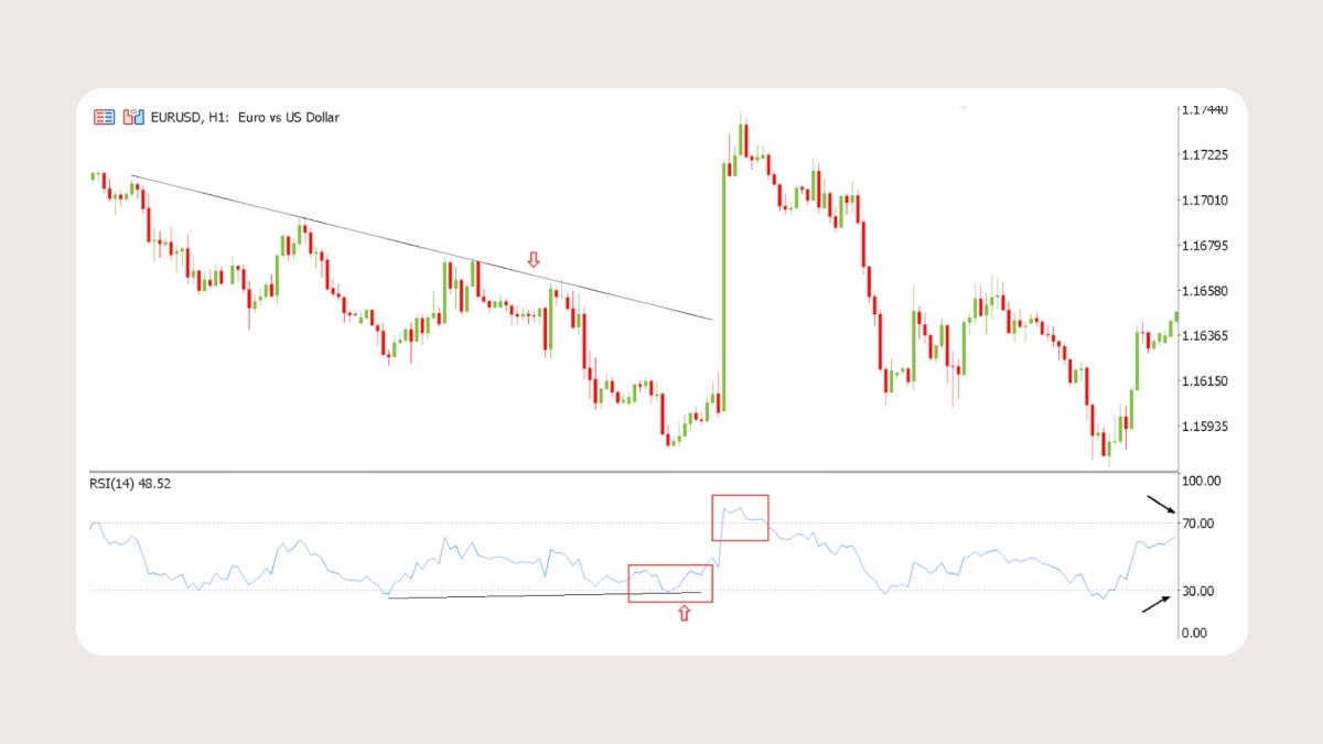
The Relative Strength Index (RSI) is a momentum indicator that shows how quickly a price is moving and whether it’s stretched too far in one direction. When it gets into extreme territory, that often hints the market may be due for a pause or reversal.
An RSI above 70is overbought: buyers may take profits here, pushing the price back down.
An RSI below 30is oversold: sellers may run out of steam and the price could bounce.
Divergence: if the price makes a new high but the RSI makes a lower high, momentum is fading and a reversal may follow. The same works the other way around in a downtrend.
Settings & timeframe tips
Default: 14-period RSI
Classic levels: 70/30. In strong trends, widen to 80/20
Best on H1–daily charts
M5–M15 charts are usually too noisy
Common mistake:shorting when RSI >70 or buying when RSI < 30 without checking trend context
Pros of RSI:
Easy to read: a line that moves between 0 and 100
Useful for spotting reversals and exhaustion points
Works well with trend indicators like moving averages
Cons of RSI:
In strong trends, the RSI can stay overbought or oversold for a long time. Many traders mistakenly jump in too early
SummaryThe RSI gives you a quick snapshot of momentum and possible turning points. Use it to filter entries and exits, but always confirm with another tool like a trend or volatility indicator.
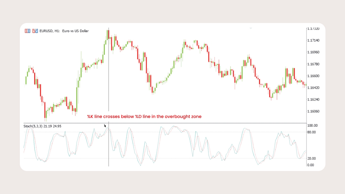
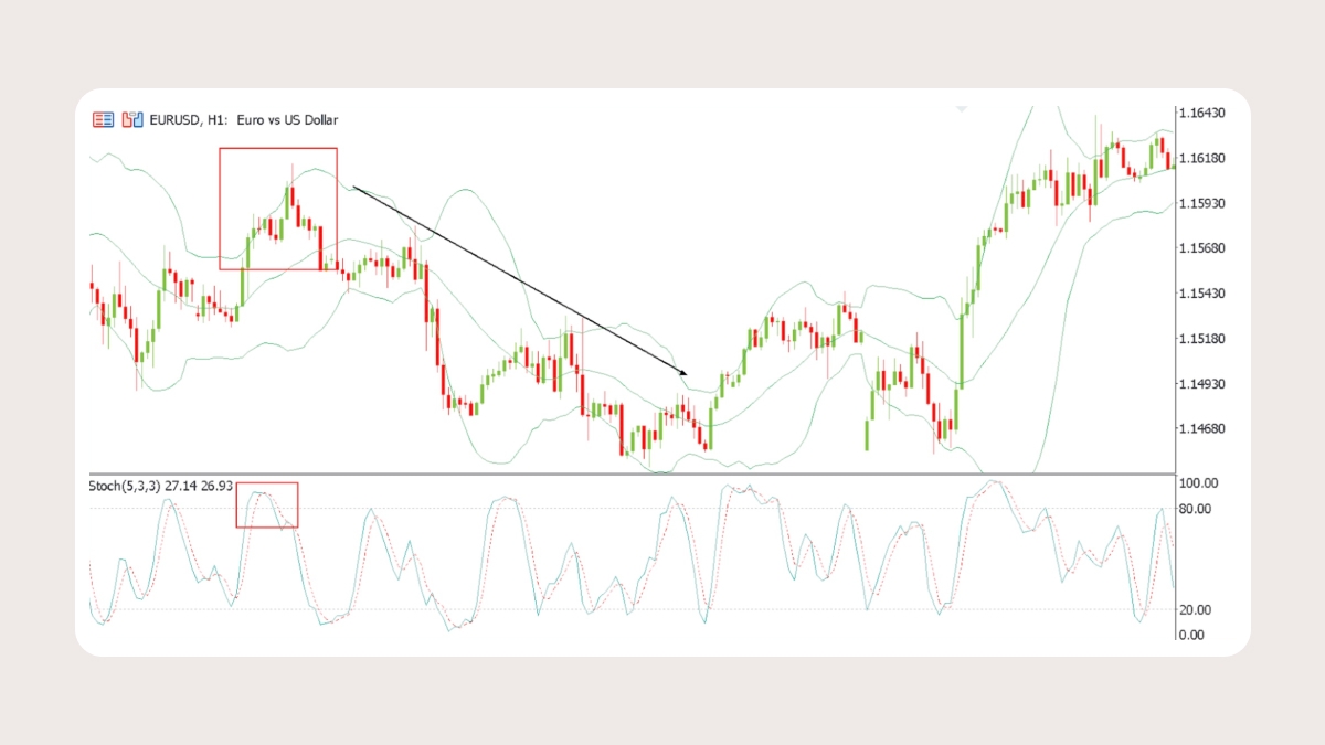
Stochastic Oscillator – momentum and reversals
The Stochastic Oscillator is another momentum tool. It looks at where a price closes compared to its recent high and low. This gives you early hints of possible reversals through overbought and oversold readings and crossovers.
How to read it:
If values are above 80, the market is overbought. The move up may be running out of strength.
If values are below 20, the market is oversold. Selling pressure could be finished for now.
Pay attention to crossovers. When the fast line (%K) crosses below the slow line (%D) in the overbought zone, that can hint at a sell. When %K crosses above %D in the oversold zone, that can point to a possible buy.
Settings & timeframe tips
Default: 5,3,3 (%K and %D)
Overbought above 80, oversold below 20
Best on M15 through H4 charts for timing reversals
Pros:
Responds quickly to momentum changes
Useful for spotting short-term reversals
Works well in sideways or range-bound markets
Cons:
Can throw out false signals in strong trends
Needs confirmation from other tools to avoid whipsaws
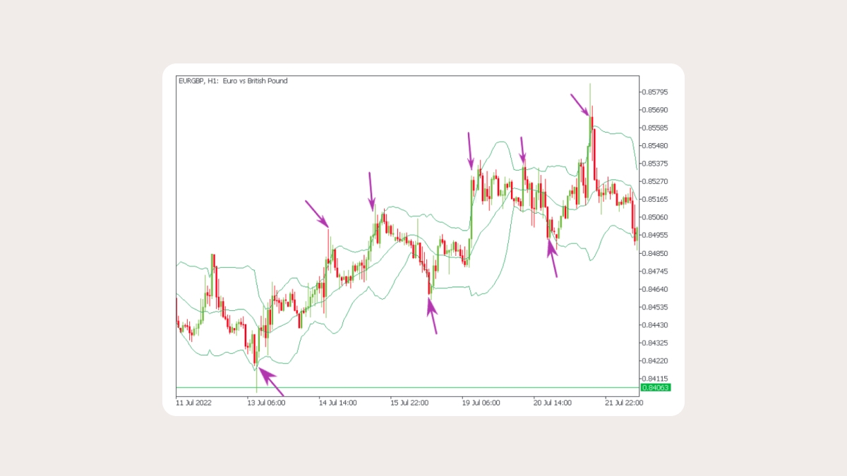
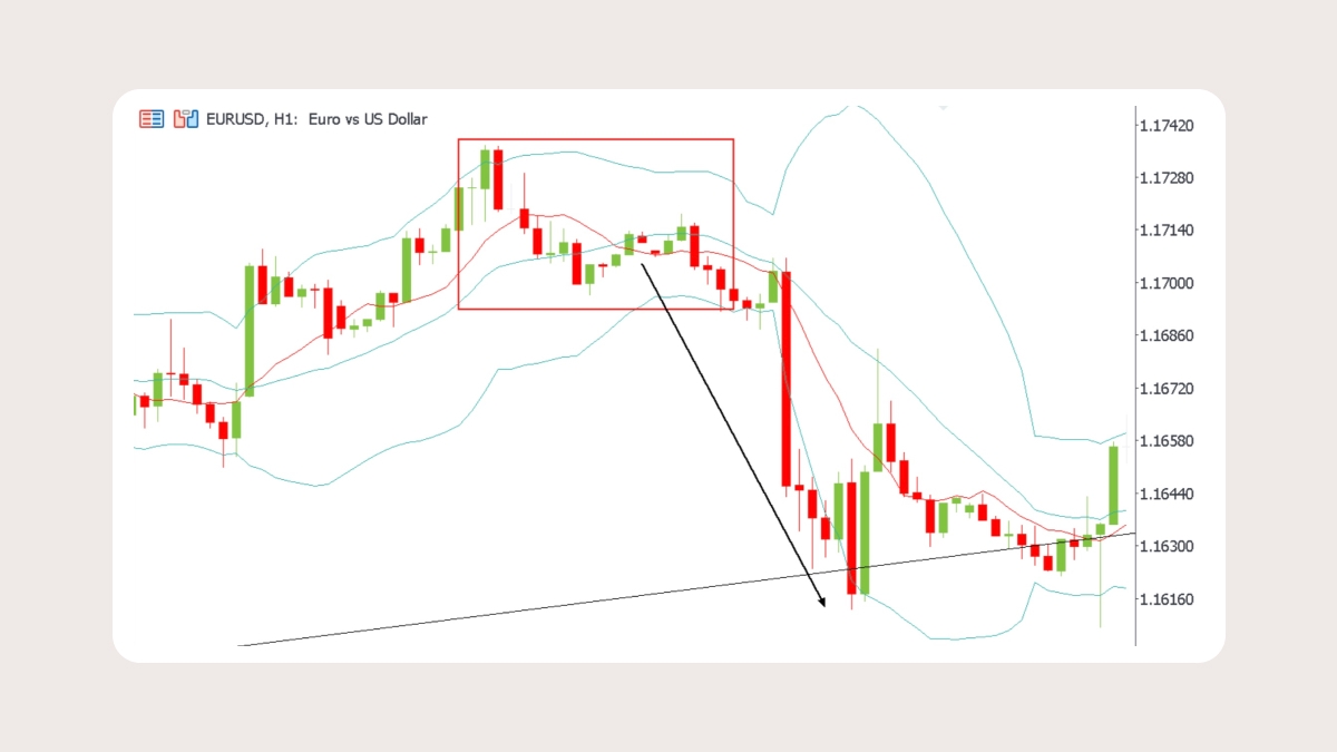
2. Bollinger Bands
Bollinger Bands are three MA lines that help measure market volatility. The middle band is usually a 20-period SMA that identifies trend direction. The upper and lower bands (“volatility” bands) are two standard deviations above and below the middle band. The price is constantly revolving around the middle line. When the outer bands stretch wider, market volatility increases, and vice versa. High and low volatility periods usually follow each other, so the narrowing of the bands often means that the volatility is about to increase sharply.
Pros:
- Great in a sideways market, because the lines can be used as support and resistance levels
Cons:
Not useful in trending markets
Need confirmation from other indicators
How to read them:
The closer the price approaches the upper band, the more overbought the asset becomes. It eventually stops rising and reverses.A move above the upper band or below the lower band can mean different things depending on market context. In ranging conditions, touches often signal exhaustion and potential reversals. In strong trends, however, price can “walk the band,” and breaks may confirm continuation. Always seek confirmation with a trend filter or momentum tool before taking action.
Settings & timeframe tips
Default: 20-period SMA with 2 standard deviations
Works best on H1–daily charts. Very low timeframes often give “fakeouts”
Common mistake:treating every band touch as a reversal signal
3.ATR
The Average True Range (ATR) measures volatility. It tells you how much the market typically moves over a set period. Traders often use it to set stops and manage risk because it adjusts automatically as markets get busier or quieter.The ATR looks at each bar and finds the biggest of three values: today’s high minus low, today’s high minus yesterday’s close, or yesterday’s close minus today’s low. That “true range” is then averaged over a number of periods, usually 14. The ATR focuses only on volatility — how wide the swings are, not their direction.
How to read it
If the ATR line is climbing, price swings are getting larger. If it’s falling, the market is calming down.
It helps you avoid placing stops too tight. If ATR shows 50 pips on EURUSD, a 10-pip stop is almost certain to get taken out by noise. One or two times the ATR is usually safer.
A quick rule of thumb is that readings above 25 suggest strong trending conditions. Values below 25 usually mean a weak or flat market.
Settings & timeframe tips
Default: 14 periods
Any timeframe
Best when combined with a trend tool. In an uptrend, ATR helps you place a stop that won’t get hit by normal pullbacks
Pros:
Adjusts naturally to market conditions, so your stops and position size adapt as volatility changes
Works in any market and timeframe
It’s a line, so it’s easy to read
Cons:
In very quiet markets, it can be hard to find good stop levels to work with
Needs to be used with another tool since it doesn’t give trade signals on its own
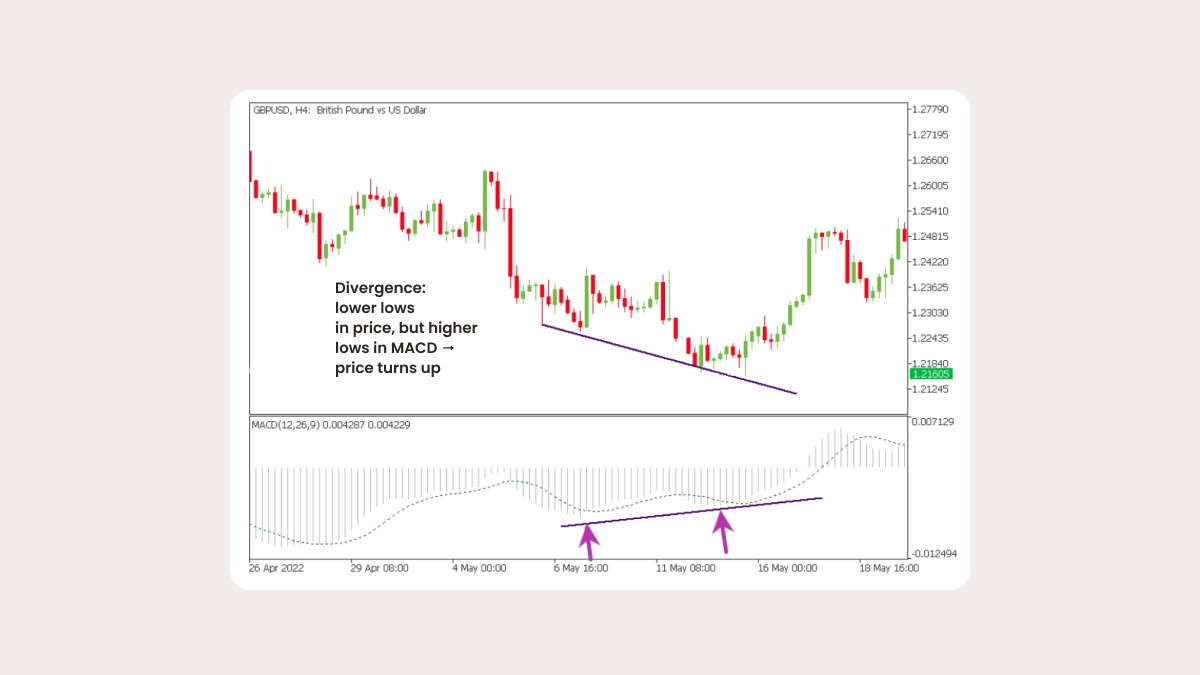
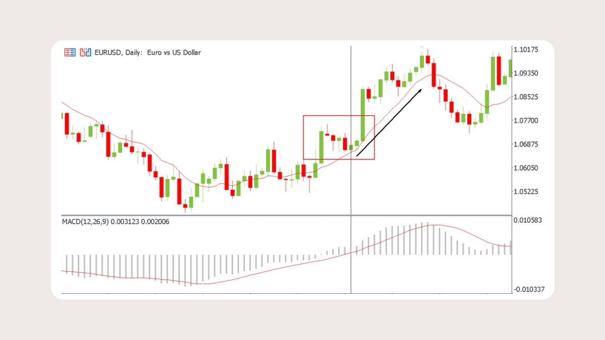
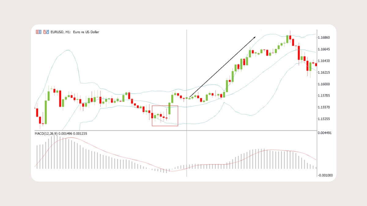
4. MACD
MACD (moving average convergence/divergence) is an oscillator that measures the driving force behind the market. It shows when the market gets tired of moving in one direction and needs a rest (correction). After oscillators reach extreme levels, they often swing back. This reversion can happen before a slowdown or reversal in price, but strong trends can persist. Always seek confirmation.
How it works:
The MACD line is the difference between the 12- and 26-period EMAs.
The Signal line is a 9-period EMA of the MACD line.
The Histogram is a bar chart that shows the distance between the MACD line and the Signal line.
How to read it:
Dramatic rise/fall: Sell when histogram bars start declining after a big rise. Buy when histogram bars start growing after a big decline.
Crossovers between the histogram and the signal line: Buy when the MACD-histogram rises above the signal line. Sell when the MACD-histogram falls below the signal line.
Zero line as additional confirmation: When the MACD crosses the zero line, it shows bull or bear strength. It can be a signal to buy when the MACD-histogram rises above 0 and to sell when it falls below 0.
Divergence: If price rises and MACD falls, the rally isn’t confirmed by the indicator, and can be about to end. The same goes for the opposite.
Settings & timeframe tips
Default: 12, 26 EMAs + 9 EMA (signal line)
Best on H1 charts and higher
Signals are noisy on M1–M5 charts
Common mistake: relying solely on crossovers without considering the broader trend
Pros:
MACD can be used in both trending or ranging markets
If you understand the MACD, it will be easy for you to learn how other oscillators work
Cons:
- The indicator lags behind the price chart, so some signals come late and are not followed by a strong market move
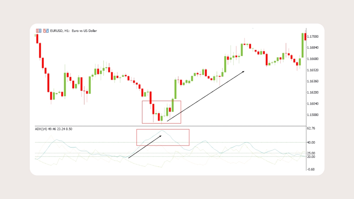
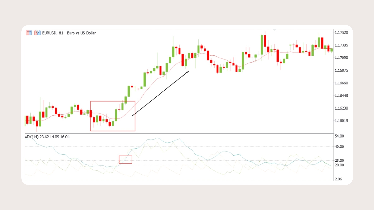
5. ADX
The Average Directional Index (ADX) measures how strong a trend is. It’s based on two other lines: +DI and –DI. These track upward and downward moves in price. The ADX line itself is just a smoothed average of the difference between them.
When ADX is below 20, the market is weak and usually stuck in a range.
When it rises above 25, a trend is starting to take shape.
When it climbs above 40, the trend is strong and momentum is picking up.
If ADX starts falling, the trend is losing energy even if the price keeps moving in the same direction.
Settings & timeframe tips
The default setting is 14 periods
Readings above 25 suggest a trend, while readings below 20 point to a sideways market
More reliable on H4 and daily charts than short-term ones
ADX doesn’t show direction, it only measures strength
Pros:
It helps filter trades. If ADX is below 20, you can skip weak setups in flat markets
It confirms breakouts. If ADX is rising during a breakout, that move is more likely to be real
Cons:
It doesn’t tell you if the market is bullish or bearish, so combine it with another trend tool like a moving average or MACD
It can be slow to react because it uses smoothed averages
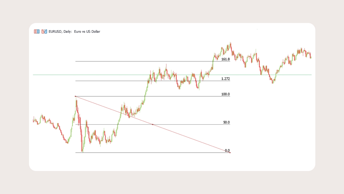
6. Fibonacci retracements and extensions
Fibonacci retracements are lines you place on a chart to highlight possible support or resistance. They’re based on ratios from the Fibonacci sequence, with common levels like 23.6%, 38.2%, 50%, 61.8%, and 78.6%. Traders pay attention to these areas because a price often pauses or even reverses when it hits them.
How to use retracements:
In an uptrend, after a strong rally, retracement levels can show where buyers might step back in.
In a downtrend, after a selloff, they can mark areas where sellers may return.
Watch the 38.2% and 61.8% levels.
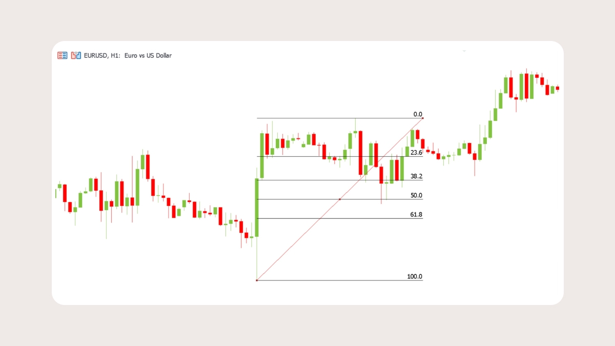
Extensions:Once a pullback is over, Fibonacci extensions project possible targets for the next move. Common levels are 127.2%, 161.8%, and 261.8%. Many traders use these as natural take-profit zones when riding a trend.
Settings & timeframe tips
Default: retracement levels at 23.6%, 38.2%, 50%, 61.8%, 78.6%; extension levels at 127.2%, 161.8%
Works on all timeframes
More reliable on H4–Daily chart swings
Pros:
Very simple to apply
Powerful when they overlap with other signals like moving averages, Bollinger Bands, or previous support and resistance
Cons:
They’re subjective because your retracement depends on which swing points you choose
They aren’t reliable on their own
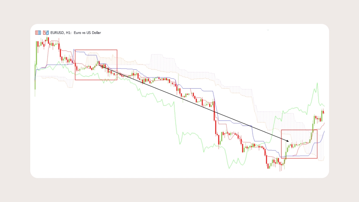
7. Ichimoku
The Ichimoku is a trading system that combines several ideas in one, letting you see trend, momentum, and support/resistance all together. It is made up of the following parts:
Kijun-sen (baseline): shows the medium-term trend. You can think of it as the market’s balance point.
Tenkan-sen (conversion line): highlights the short-term trend. It reacts quickly and shows you recent shifts in momentum.
Senkou Span A & B (the cloud, or Kumo): project future support and resistance.
Chikou Span (lagging line): checks momentum by comparing the current price with past levels.
How to read it:
Price above the cloud signals a bullish market. Below the cloud is bearish, and inside the cloud means consolidation.
A Tenkan-sen crossing above or below the Kijun-sen can be a buy or sell signal.
The cloud’s edges act like dynamic support and resistance.
A thick cloud suggests strong barriers, while a thin one points to weaker support or resistance.
Settings & timeframe tips
Default: 9, 26, and 52, based on traditional Japanese trading
Works best on daily and weekly charts, though H4 is also widely used
Common mistake: focusing only on Tenkan/Kijun crosses and ignoring the cloud
Pros:
Combines trend, momentum, and support/resistance
Useful for trend-following and breakout strategies
Cons:
Looks intimidating
It doesn’t work well on very short-term charts
How to combine indicators: ready-to-use setups
Relying on a single indicator can leave you blind to some of the picture. Here are some practical ways to combine two or three indicators that complement each other.
Example 1: MA + MACD — trend with momentum confirmationUse the MA to define overall direction. Then wait for MACD crossovers to confirm the entry. This helps you avoid trading against the trend and improves your chances of catching stronger moves.
Example 2: Bollinger Bands + MA — spotting breakoutsWhen the bands narrow, it often signals a breakout. If the price breaks beyond a band in the same direction as the MA, that breakout has a higher chance of continuing.
Example 3: Bollinger Bands + MACD — filtering false signalsWhen the price touches an outer band, it could mean either exhaustion or trend continuation. Check the MACD to decide. If momentum is fading, stay cautious. If it’s accelerating, the breakout is more reliable.
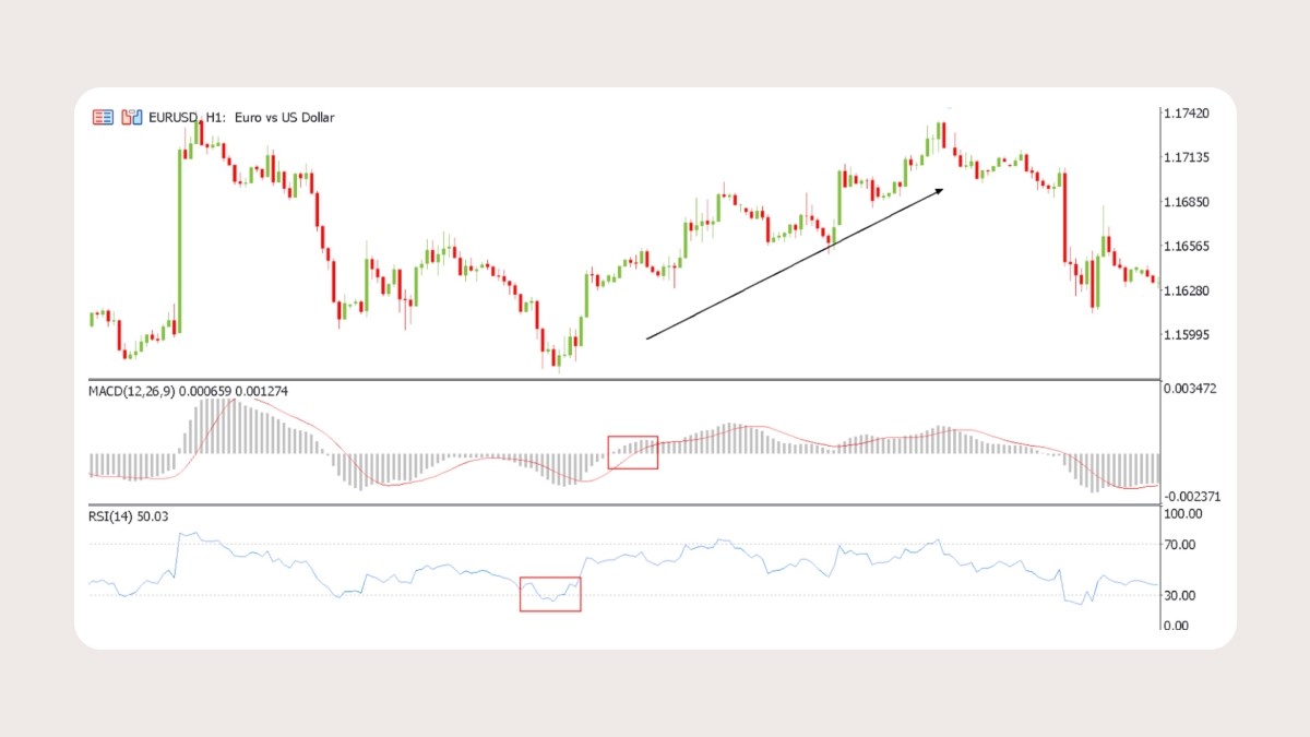
Example 4: RSI + MACD — momentum confirmation
RSI highlights overbought and oversold territory. MACD crossovers confirm when momentum is truly shifting. For example, you have a strong buy setup if the RSI exits the oversold zone and the MACD gives a bullish crossover.
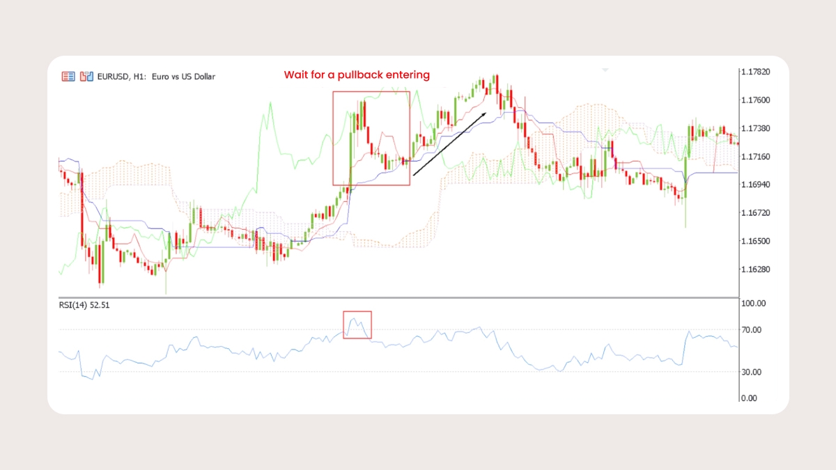
Example 5: Ichimoku + RSI — trend and exhaustion
The Ichimoku defines the trend by showing whether the price is above or below the cloud. The RSI warns you when momentum is stretched. For instance, if the price is above the cloud, the trend is bullish. But if RSI is above 70, it may be better to wait for a pullback before entering
Example 6: Stochastic + Bollinger Bands — timing reversals
Bands show price extremes; Stochastic pinpoints the exact point when momentum flips. Example: price touches the upper band while Stochastic crosses down from overbought — short entry.
Example 7: ADX + MA — trend filter
MA shows direction, ADX shows strength. Enter only when the price is above MA and ADX > 25. Skip flat signals when ADX < 20.
Risk warning: Even when indicators work well together, no setup is perfect. Always trade with stop-losses and take-profit levels. Indicators can guide you, but it’s discipline and risk management that protect your capital.
Leading vs. lagging indicators
Some indicators can give you a heads-up while others help confirm something that is already underway. Know what each does so that you can pick the right tool for the situation.
Leading indicatorsLeading indicators are used to get ahead of the price. They give off signals before the move actually happens. Traders use them to try to guess when a reversal or breakout might be coming.
Examples: RSI, Stochastic, and Fibonacci retracements.
They’re especially handy when the market is stuck in a range or sitting at a level where a turn could happen.
They’re not always right. If a trend is strong and keeps driving forward, a leading indicator might call for a reversal that never shows up.
Lagging indicatorsLagging indicators follow price and confirm what’s already happening. They aren't built to spot the start of a move. Instead, they smooth out the noise and help you spot the trend.
Examples: Moving averages, MACD, Bollinger Bands, ADX, and Ichimoku.
They’re most effective for riding the momentum in trending markets.
Because they show confirmation after the fact, you might miss the ideal entry point.
Use both
A leading indicator can highlight a possible setup, while a lagging indicator tells you if the move has real strength behind it. For example, imagine RSI shows oversold conditions. That’s a leading clue. If the MACD also points to an uptrend, that’s lagging confirmation. The two together give you a stronger case for taking a long trade.
Choosing the right indicator
| Use case | What to check | Best indicators |
| Trend direction | Is the market moving up or down? | Moving Averages, MACD, Ichimoku |
| Trend strength | Is the trend strong or weak? | ADX, Ichimoku |
| Momentum & exhaustion | Is momentum weakening? | RSI, Stochastic, MACD |
| Volatility | How much does the price move on average? | ATR, Bollinger Bands |
| Support & resistance | Where could the price pause or reverse? | Fibonacci retracements, Ichimoku Cloud, Bollinger Bands |
| Breakouts | Is a big move coming? | Bollinger Band Squeeze, ADX, Moving Averages |
| Stop and target sizing | Where to set realistic stops and profits? | ATR, Fibonacci extensions |
How to manage risk
Even the best setup can lead to losses without solid risk management. Every trade should have clear rules for stops, profit targets, and position size.
Position sizing
Risk only 1 or 2 percent of your account on a single trade.
Stops
Place your stop beyond a clear structure level: a recent swing high or low, the edge of a Bollinger Band, a Fibonacci retracement, or the boundary of the Ichimoku Cloud.
Profit targets
Aim for profits that are at least twice the size of your stop. Use logical levels to set exits, such as Fibonacci extensions, the opposite Bollinger Band, or major support and resistance zones.
Common mistakes when using indicators
1. Relying on a single indicator
No single tool is enough to know exactly when to buy or sell. Use at least two that complement each other, such as a trend indicator with a momentum tool.
2. Ignoring market conditions
If you apply oscillators like the RSI or Stochastic in a strong trend, they’ll often scream “reversal” far too early. Figure out whether the market is trending or ranging, then use the indicators that fit that situation.
3. Over-tuning indicator settings
It’s tempting to keep adjusting settings until the past charts look perfect. This is called curve-fitting, and it usually doesn't work when trading live. Stick to common defaults like the RSI 14 and MACD 12-26-9, or moving averages at 20, 50, and 200. Change them only if you have a clear reason to do so.
4. Expecting indicators to predict the future
Indicators can give you signals, but they don’t know the future, and markets are unpredictable. They take past price action and show it in a way that makes patterns easier to spot. Use them as guides and always look for confirmation before acting.
5. Using too many indicators
Crowding your chart with too many indicators just creates confusion. You’ll get signals pointing in different directions and won’t know which ones to trust. Focus on two or three that cover the essentials: trend, momentum, and volatility or structure.
FAQ
What indicators are good for beginners?
Moving Averages, RSI, and MACD are easy to read and give traders information about trends, momentum, and reversals.
How should indicators be combined?
Don't combine indicators that all show the same type of information. Vary three different types to get an all-around picture.
Do the settings need to be adjusted?
The default settings work fine. You can adjust them later if you understand what the change does.
What mistakes do traders make?
Using too many indicators or trusting them without checking price action. RSI might say overbought, but that doesn't mean the move is over.
Key terms
Overbought
The price has climbed too far, too fast. Traders often expect a pullback from here. A common sign is RSI above 70 or Stochastic above 80.
Oversold
The price has dropped too quickly, and many traders are looking for a bounce. You’ll often see RSI below 30 or Stochastic below 20.
Divergence
Sometimes price and an indicator don’t agree. Price may push to a new high, but the RSI forms a lower high instead. That kind of mismatch often suggests momentum is running out of steam.
Standard Deviation
This is just a way of measuring volatility. With Bollinger Bands, when the bands spread wide, it means standard deviation is higher and the market is more volatile. When the bands tighten, volatility is lower.
Retracement
In a trend, the price doesn’t move straight up or down. It often pulls back partway before continuing. For example, during an uptrend, the price might dip to the 38.2% Fibonacci level before heading higher again. That dip is called a retracement.
Extension
Extensions are Fibonacci levels that go beyond 100 percent. Traders often use them to set profit targets. The 127.2 percent and 161.8 percent levels are two of the most common.
Support
A price level where buyers tend to step in and stop the fall. Many traders expect the price to bounce when it reaches the support level.
Resistance
A level where sellers usually push back against a rising price. Traders often expect the rally to stall or pull back at the resistance level.
Lagging Indicator
An indicator that reacts after the price has already moved. It confirms the trend once it’s underway.
Leading Indicator
An indicator that gives early signs a turn might be coming.